[ Identity Systems ]
See how user-centered design, product thinking, and systems strategy were used to solve real business problems and drive measurable growth.
book a call

[ Haven Interiors Process ]
[ Overview ]
[ 10,000 Foot View ]
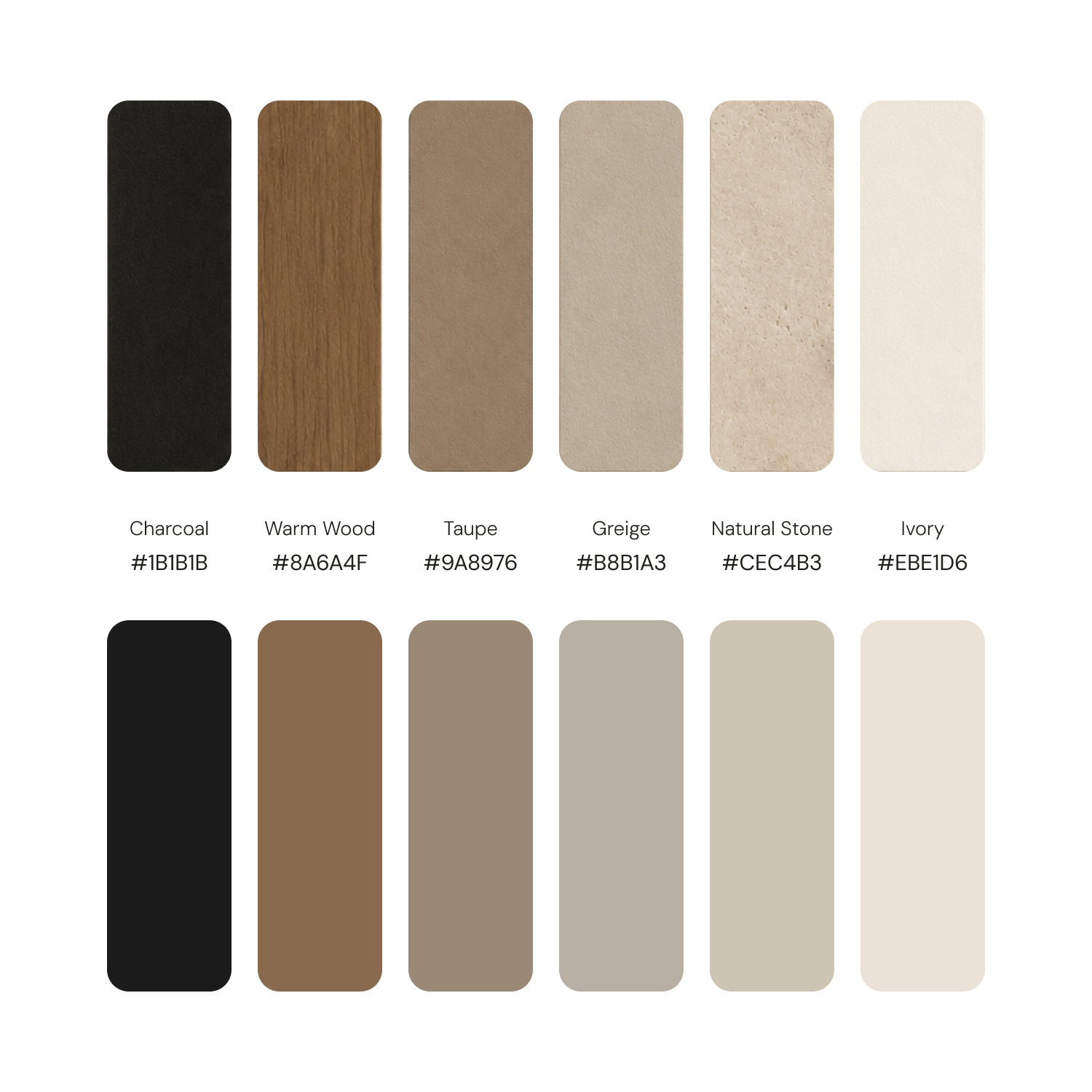
Haven's brand doesn't compete for attention; it earns it through refinement.
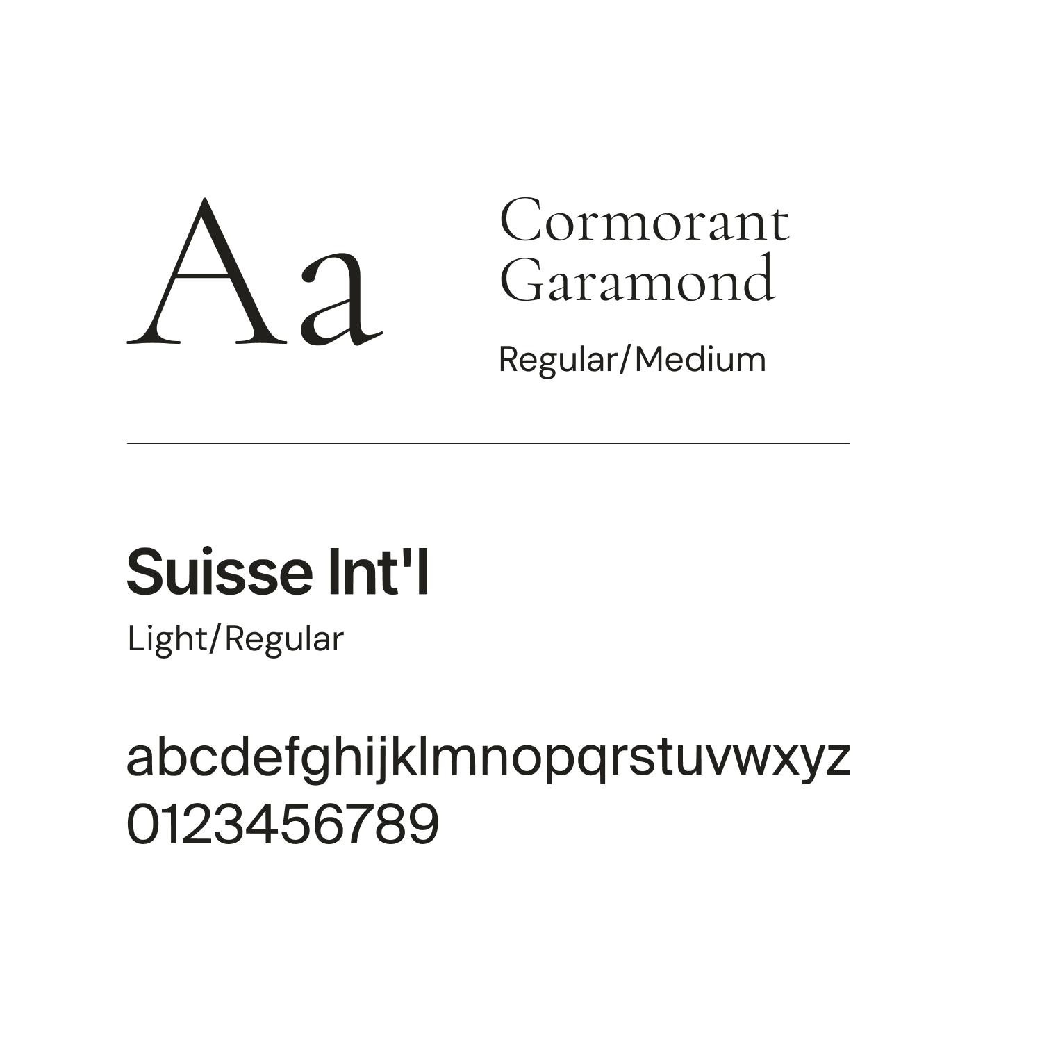
Typography, spacing, and imagery are given room to breathe, creating a sense of calm and confidence rather than urgency.
[ Design Philosophy ]
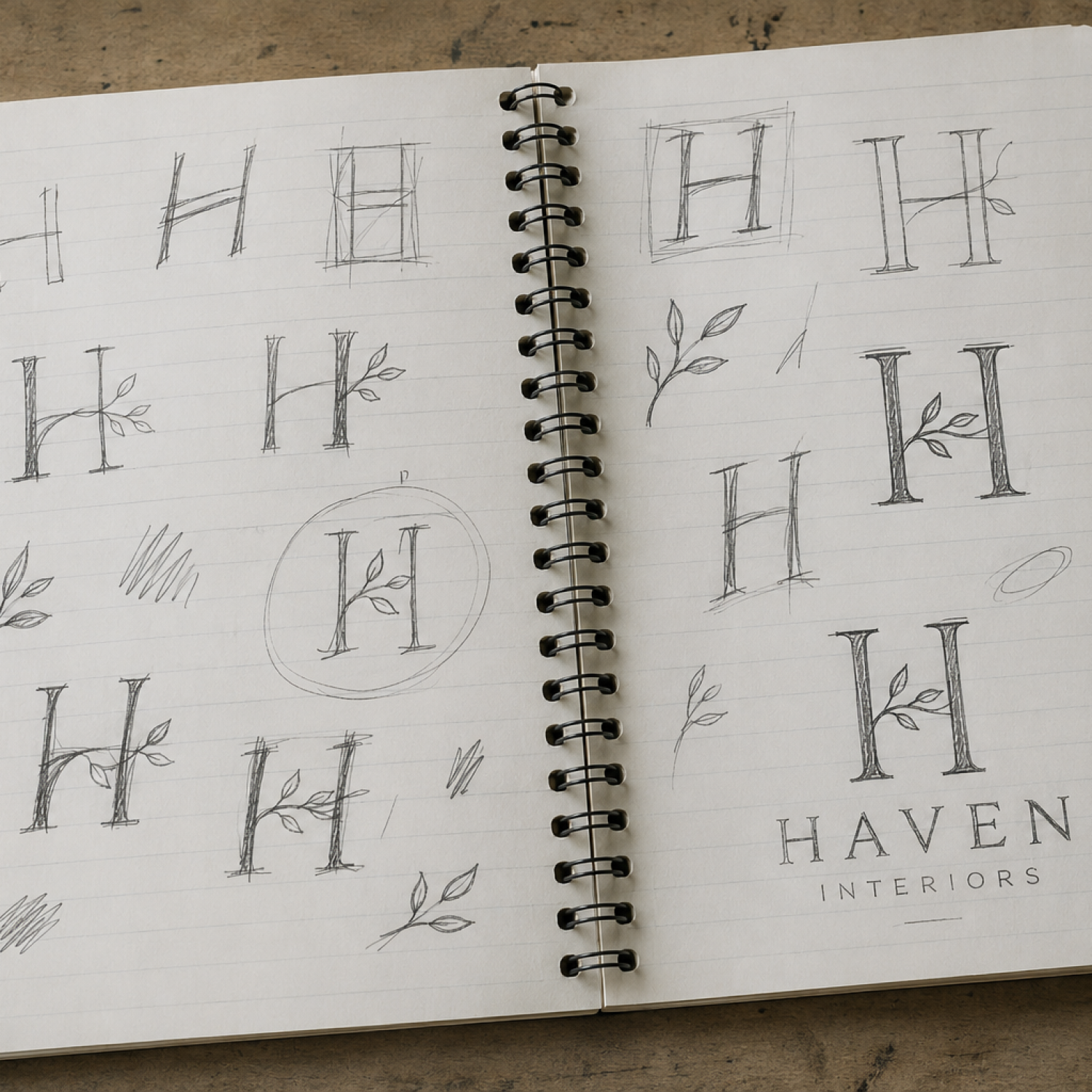
The Haven identity is built around intentional restraint, where every element serves a purpose and simplicity creates space for the work to speak.
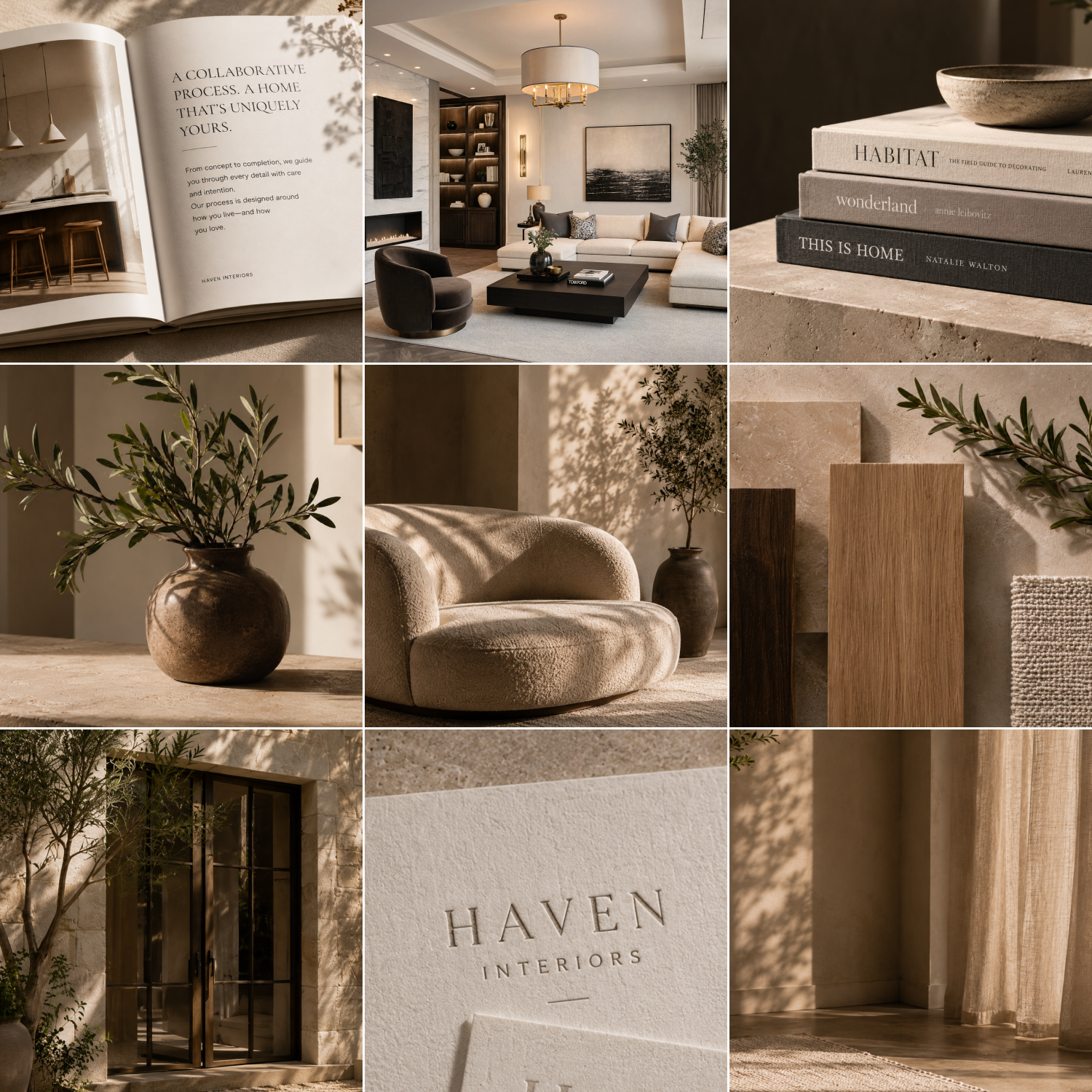
Inspired by natural materials, timeless architecture, and quiet luxury, the brand emphasizes warmth, permanence, and thoughtful living.
[ Visual Language ]
Soft natural light, generous whitespace, refined typography, organic textures, and carefully balanced compositions create a calm, premium visual experience.
[ Brand Keywords ]
Architectural • Editorial • Natural • Organic • Sophisticated • Tactile • Curated • Calm • Purposeful • Human
[ Waytides Process ]
[ Overview ]
[ 10,000 Foot View ]
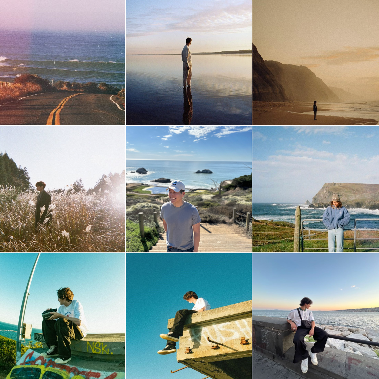
The ‘waytides’ brand is built on nostalgia, atmosphere, and the feeling of looking back while moving forward.
Visuals that evoke memory, landscapes that give space to think, and a tone that feels personal - like a note from an old friend.
[ Design Philosophy ]
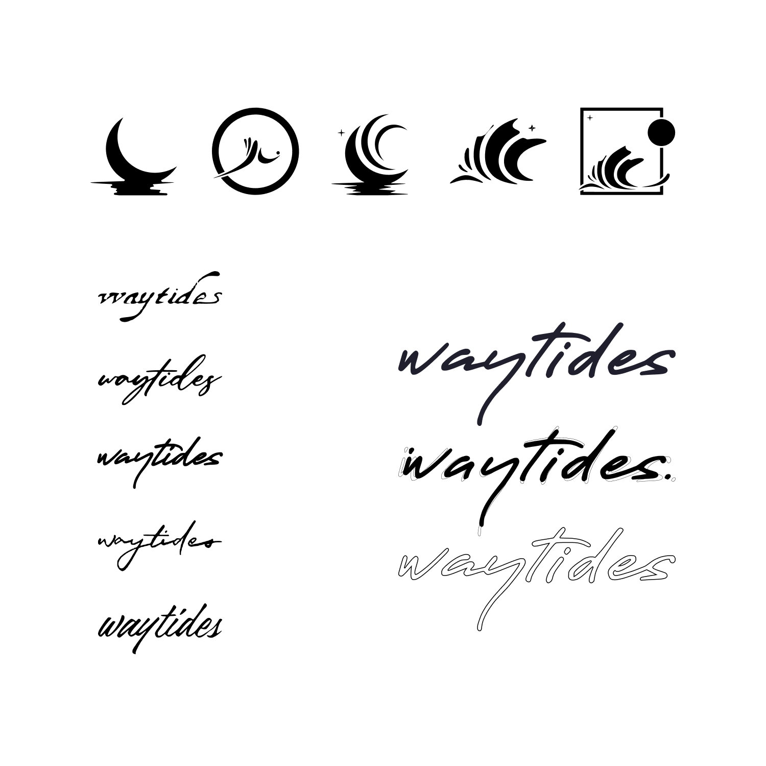
Built around emotion before aesthetics, the 'waytides' identity explores memory, atmosphere, and human connection through restrained, cinematic design.
Every visual decision supports the feeling of the music, creating a cohesive world that listeners can immediately recognize and emotionally connect with.
[ Visual Language ]
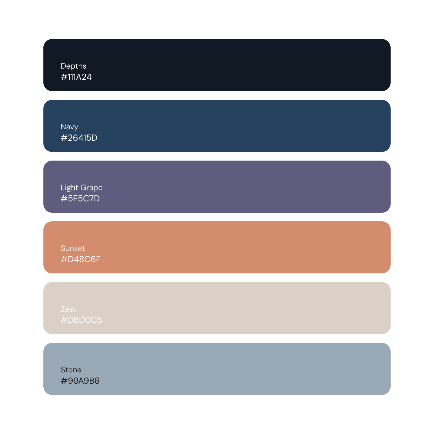
Muted gradients, natural landscapes, soft light, subtle grain, expansive negative space, and minimalist typography create an immersive visual atmosphere.
[ Brand Keywords ]
Emotive • Nostalgic • Organic • Dreamlike • Introspective • Timeless • Textural • Expansive • Melodic • Honest
[ Drift Process ]
[ Overview ]
[ 10,000 Foot View ]
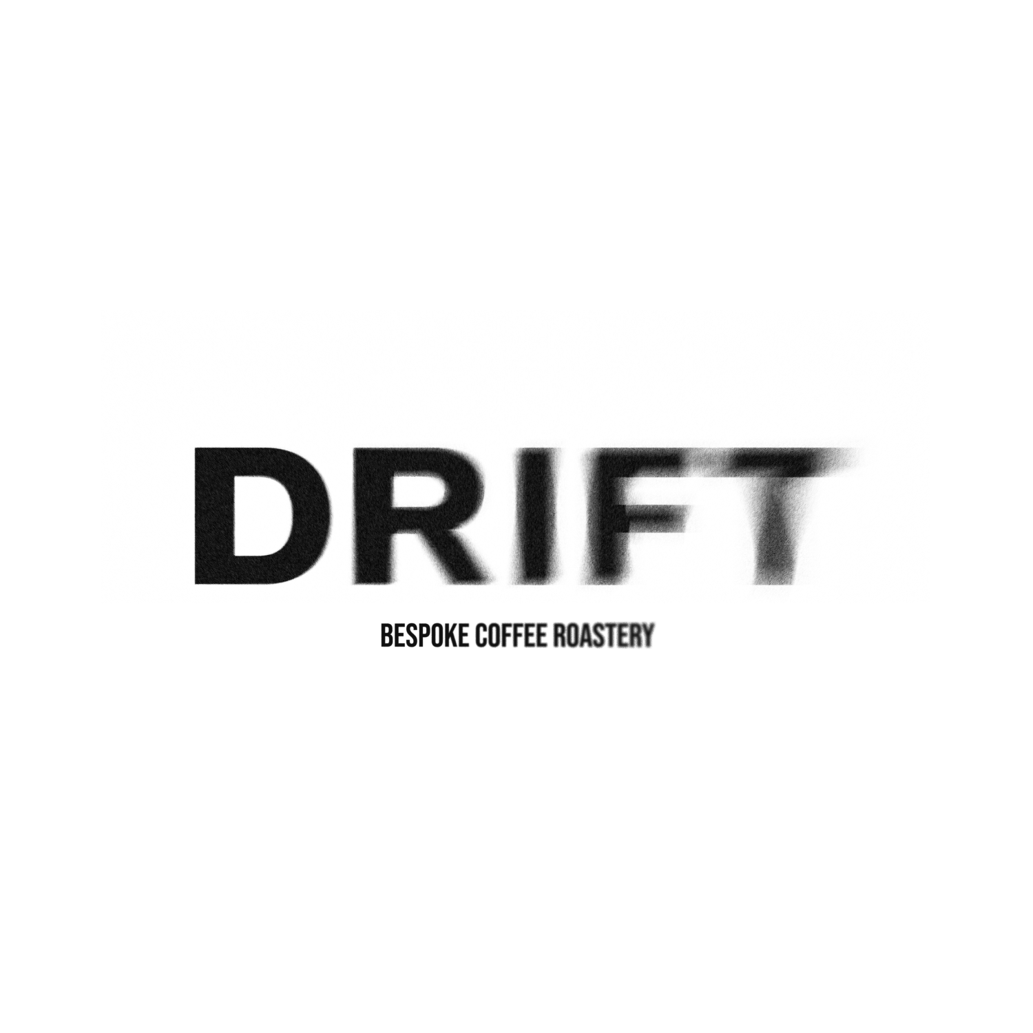
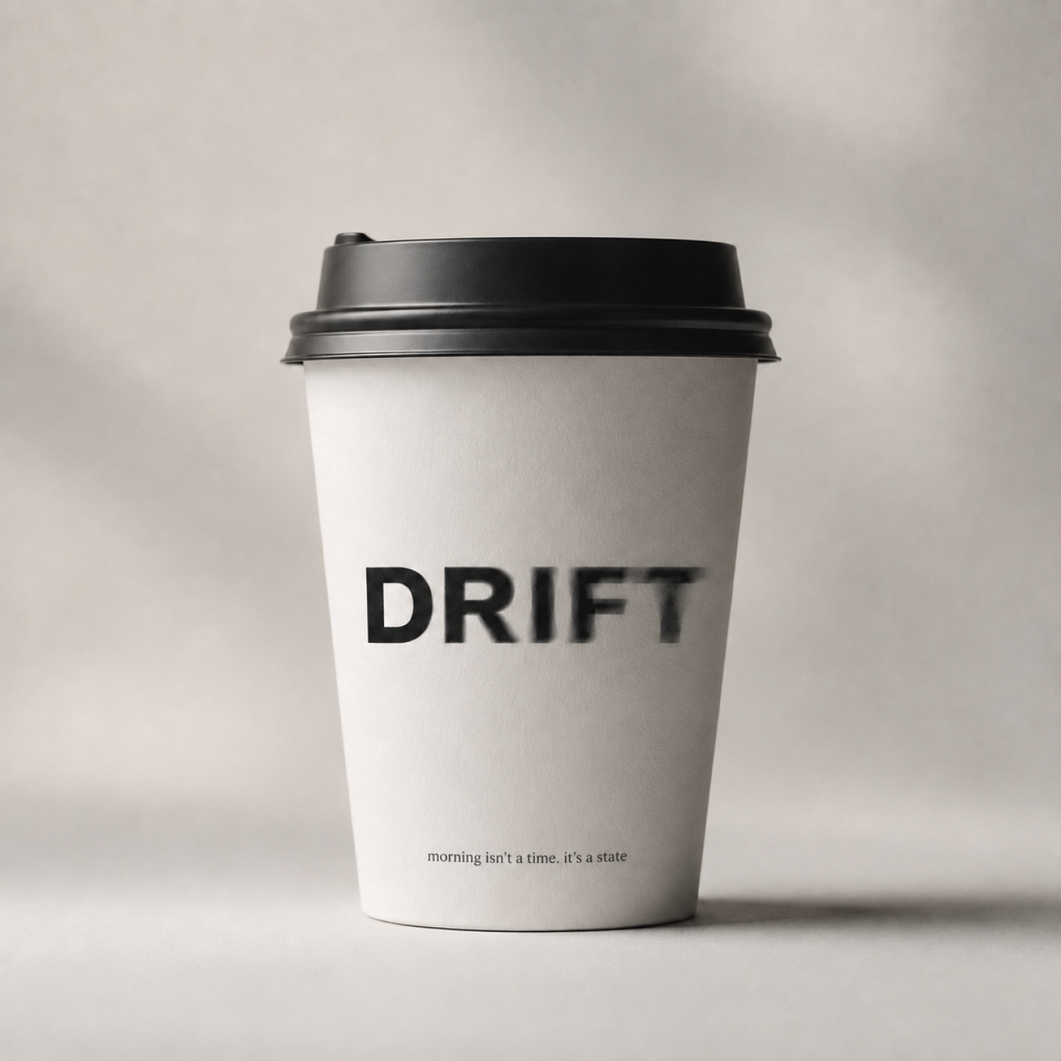
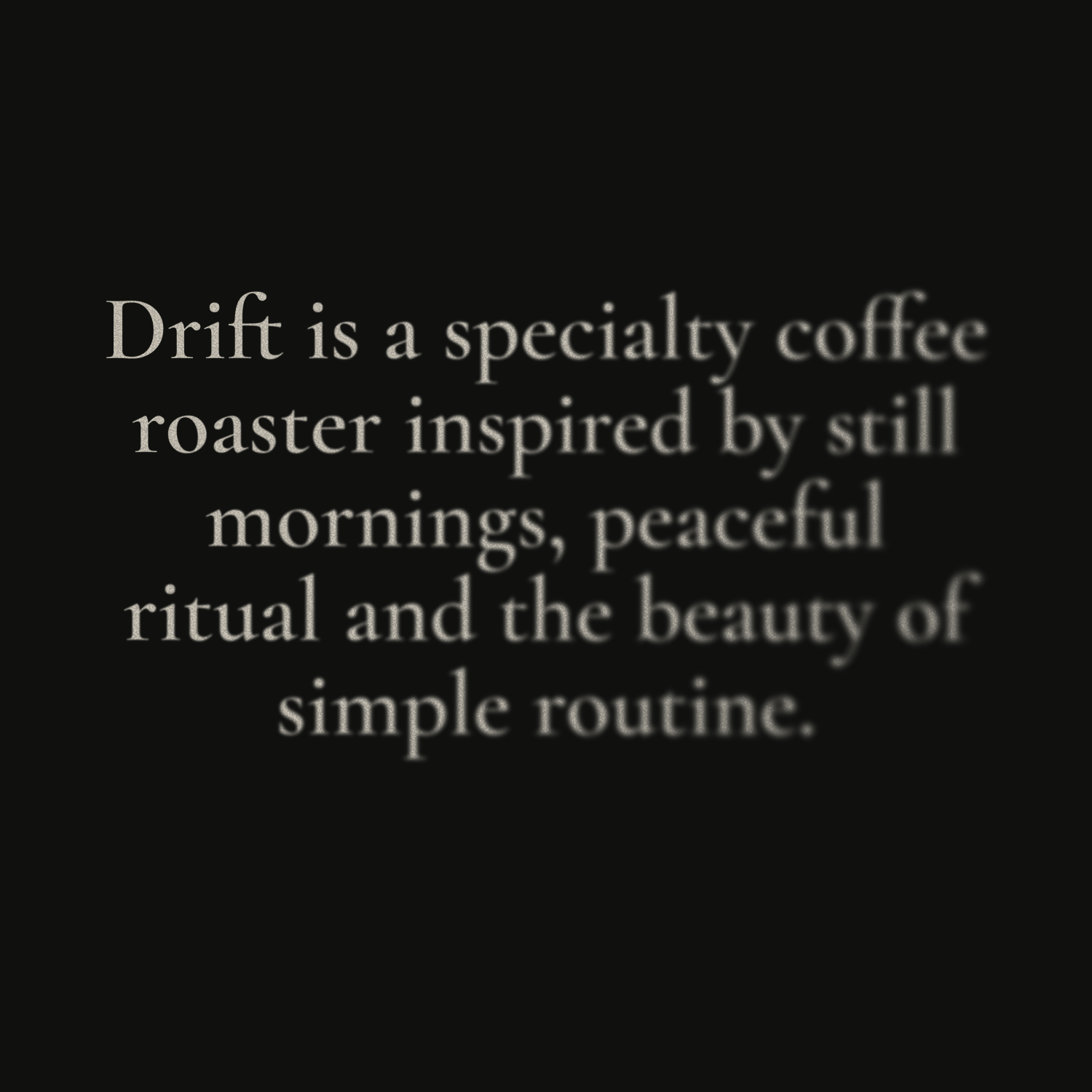
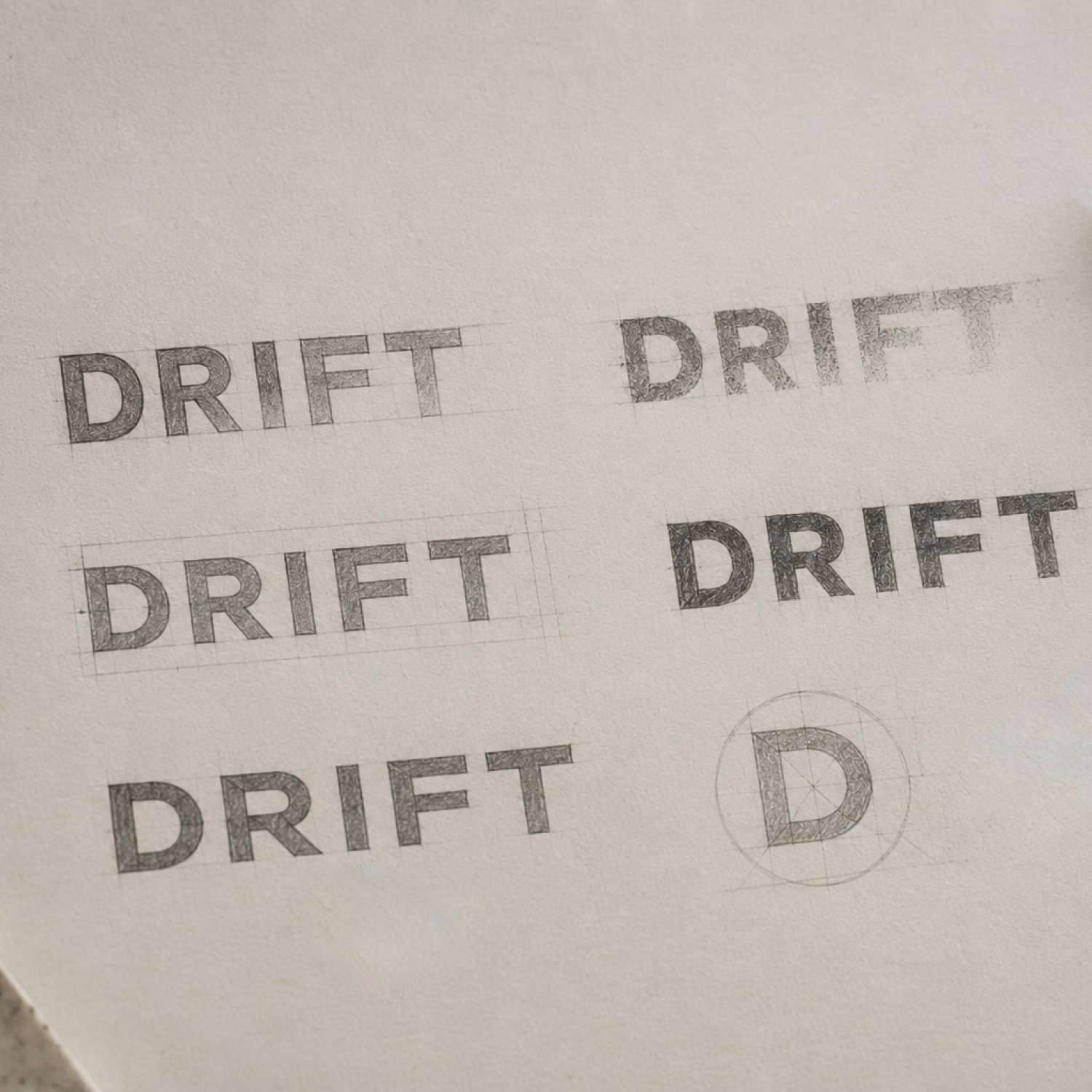
Drift is a fictional specialty coffee roaster created to explore how identity can transform an everyday ritual into a memorable brand experience.
The project was developed as an exercise in positioning, visual storytelling, packaging, and digital design.
[ Design Philosophy ]
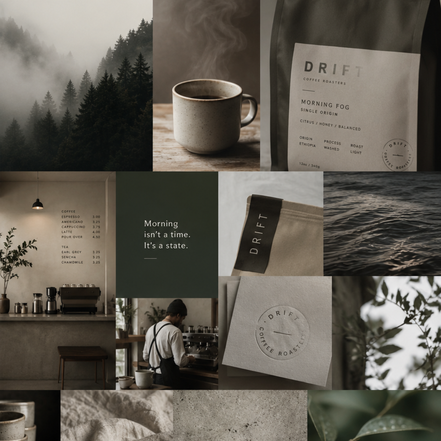
The brand balances bold structure with softness and imperfection. Clean typography, restrained composition, and tactile materials create a grounded foundation, while blur, mist, grain, and dissolving forms introduce a sense of movement and atmosphere.
Every decision supports one idea: morning isn’t a time... it’s a state.
[ Visual Language ]
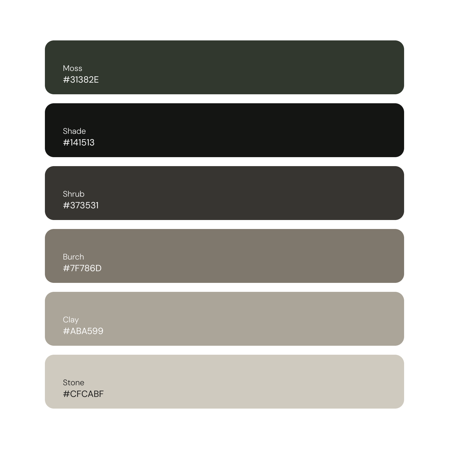
Bold geometric typography paired with generous negative space, warm neutral tones, natural textures, soft directional light, and subtle atmospheric effects.
Photography and graphics should feel quiet, tactile, and slightly mysterious; ceramic cups, textured paper, misty landscapes, coffee rituals, organic forms, and minimal symbolic imagery rather than traditional café visuals.
[ Brand Keywords ]
Calm • Intentional • Ritual • Atmospheric • Crafted • Organic • Minimal • Tactile • Grounded • Meditative • Refined • Quiet • Timeless • Honest • Mysterious • Precise • Warm • Immersive • Symbolic • Human
[ Samples ]
Akira's Kitchen
Supper Club | Identity | 2024
Casita Tortuga
Airbnb Business | Identity & Digital | 2025
Haven Interiors
Interior Design Firm | Identity & Digital | 2023

Waytides
Music Project | Identity & Growth | 2023
Lyzz Flores
Personal Brand | Identity & Digital | 2023
The Icarus Kid
Music Project | Identity & Growth | 2023
Sentient
Music Project | Identity | 2023
Røem
Music Project | Identity | 2023

Smart Bollards
Security Products | Identity | 2022

Deirdre's Insights
Personal Brand | Identity & Digital | 2023

APEXX
Fitness Group | Identity | 2025
.png)
VBE
Talent Agency | Identity & Digital | 2024
Let’s build something great together.
Reach out to discuss your goals, and how we can best support your vision.

